
Mandarin WIP - Lighting the Scene
- Mar 22, 2018
- 3 min read
Lighting is usually a complex, although fairly straightforward, part of my process. A single light source with a single shadow and single highlight. It's the shape of the subjects that lead to complexity.
But recently, I've been wanting to up my game. I still like to go with simplicity, what with the cel-shaded shadows and sparse highlighting, but I want to push the envelope a touch more. Incorporating environmental lighting, colorful lighting at that, to define shapes and create volume - that's what I want to do. It makes the imagery more solid, more real, and therefore, more alive. This is one of the many reasons why I love cartoons. Unlike realism, which, as far as I can tell, seeks to replicate the real world (big surprise), cartooning uses the fundamentals of art like shape and color to create believable, evocative subjects. Any and all of these fundamentals can be emphasized or de-emphasized as the cartoonist wishes.
I love process just as much as I love cartooning itself, so I'm documenting it here for all to see. So here we go~


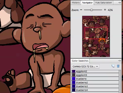
Like the shadows of yesterday, these highlights were just done without hues. This time, in white and at 20% opacity. At such a low opacity, it does look like an appropriate color to highlight with. Unfortunately, the white doesn't look so good on red hair. Looks weirdly, I dunno, neon. Had to be careful not to use too much highlighting so as not to make all the babies look weirdly greasy.
And like in yesterday's shadows, I plan to add color to them. This is just to get something down.

My first pass at the lighting.
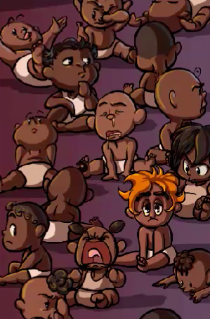
It's not bad, this. But the blue light seems a bit dreary. I'm not sure why, but it's cold and uninviting. The scene is meant to be endearing, a bit silly, and with that little touch of eeriness with baby Gretchen.
In addition, blue and orange are complimentary colors, and Gretchen's hair would clash very nicely with blue light. It would draw our eyes. But no dice.

Some of the progress from my second pass.
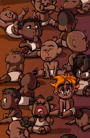
Now this is much more like it. The gold light is far warmer. Far more fitting. But I didn't want to dispense with the blue, so I used it for rim lighting on the opposite side of each subject. In the right places, both lights round out the shapes, making them solid.
A lot of times, pictures feel not quite there. They just look really stupid until they hit a certain point and then you think "It's finally coming together." I sort of had that when I had the clipping masks set up before I laid down the flats. This, however, was when it felt like was finally taking shape.


But the light can't just be flying off of them and then that's it. The colored light had to come from somewhere. On the ground, there needed to be just the tiniest gradients of blue and gold to our left and right respectively. Really sells that whole atmospheric lighting thing.
Yeah, it really IS the tiniest bit, I swear. These are screenshots from when I was adjusting the strength of said gradients. They're not that strong. You can actually see a bit of how the blue looks in the gold gradient box.

Just a little addition.
Her eyes are part of the focus of the image, and her eyes looked plain. In her adult design, Gretchen has sunken, shadowed eyes with darkness surrounding them. Surely, they'd be less sunken and whatnot if she's a baby, but the contrast and added visual interest of the dark lids rimmed with shadow was too good to pass up. Also gives her a sleepy, heavy-lidded look. Good pairing with the ridiculously thick eyebrows.


Comments