
Mini Fortress 2: Mini Heavy Lineart - WIP 1
- Aug 4, 2017
- 3 min read


It's always disheartening yet tempting somehow to resign yourself to a terrible piece of art (or what you think is terrible, anyway). You're too far in, the stage it's at prevents you from fixing it, you really just want to move on already, blah blah blah. And yes, it is true that sometimes things have limited flexibility past a certain point. But if you can, you still have to try.
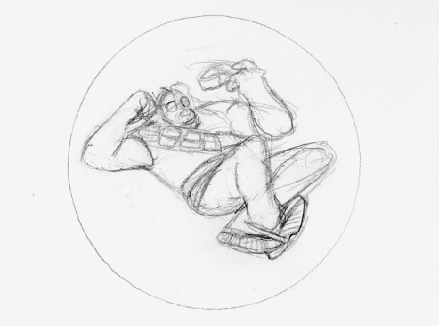
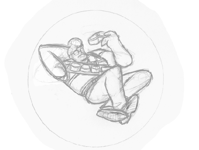
This was, at this point, my least favorite of the Mini Fortress pencils. It just didn't look nice to me, and I had, like I mentioned at the top, resigned myself to working on a piece of junk. My ability to draw using my tablet is noting compared to my ability to draw with pencil and paper, so I typically have to fix major issues in the pencilling stage. If something's really off by the time I get to the inking stage, I normally have limited powers to correct it. This seemed like one of those moments. But I decided, "No. If I'm going to do this, I'm going to fix it, and it's at least not going to look awful."
Oftentimes, it takes a lot of doing, and even with fixing things, you can feel like you're digging yourself into a disheartening hole of failure. But like I said, you still have to try.
Fixing a bad drawing isn't just "oh, gotta do a fix at the whole picture." You have to identify what about is wrong and why. That seems like a no-brainer, but it's very easy to just try to tweak things here and there, get frustrated, erase the whole thing, and give up. Be it with pencils or digital inks, you have to be brave enough to change what you worked so hard on. It might seem scary, but think about it: if it's bad, you might want to fix it.
I had a number of smaller issues, but my main problems with the original version were the position of the arm, the face, and the hair. The old arm created an ugly silhouette and looked unnatural, unlike the casual pose I was going for. The old face was too grungy or unbalanced or something (imagine that, TF2 being unbalanced). The hair was lank and also lent itself to an ugly silhouette.
To fix his arm, I just used myself as the model. I typically draw the hand before the arm, seeing as the former's placement is more important for what I usually do. But this time, I needed to see where the elbow was pointing. In this case, it was pointing up much more than I had initially thought.
His face was mostly a case of refining. The shades did not quite sit well on his face. In addition, his mouth and nose were obscured or else unclear to the eyes. On a separate layer, I used the original image as a placement guide and then drew a more pleasing version of the features on top.
The hair was originally a different cosmetic, one I do like (but can't remember now). However, because of the other elements in the picture, it didn't look good. Something that rose, in a sense, like other adjacent elements was much better than something fell.


Comments