
The Painter from France Saturation Adjustment - WIP 5
- Jul 18, 2017
- 1 min read

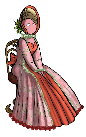

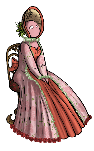
It may be a bit difficult to tell, but these are not two of the same picture. The first one is fine and perfectly serviceable, but for me, it's a wee bit too saturated. Also, while the colors are from a very limited color palette and are clearly similar, they are not as unified as I would like them to be. Almost all of them are very closely related, but it feels as though some levels in their makeup bend in the wrong way. I wanted to ground the colors with one overall tone or shade or something. The second image has a slight grey tone (if I'm using that term correctly) applied to all of the colors. It unifies them just a tad. Plus, it almost pushes it into "eerie" territory. I don't know why. Maybe 'cause it looks a bit waterlogged and eerie.


Comments