
Mini Fortress 2: Soldier Flats Comparison - WIP 2
- Jul 4, 2017
- 1 min read

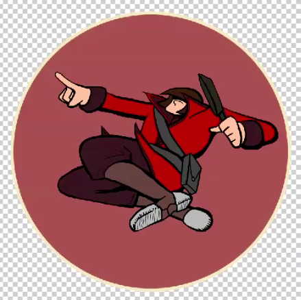

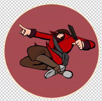
Here're two shots of flats I did for the Mini Fortress 2 Soldier.
The first was (shockingly) my first version of the flats. I wanted to keep the number of colors to a minimum. What ended up happening, though, was that it looked kind of... drab. There's something to be said for reusing colors around a picture. But this usage was empty and unappealing. It was a bit too same-y. Plus, should I shade it with this version, that dark brown would dominate the whole image, especially when you consider that the dark grey of the frying pan. In addition, all the browns have a distinct red tinge to them. Maybe it could do well in another context, but here, it's just repetitive and dumb.
The second version of the flats provided much more visual interest, given the wider variety of browns in use. The pants and boots are also in a different family of browns; they both take on a yellowish slant. Aside from just looking better, it's much closer to Soldier's actual color scheme.


Comments