
The Maas Boy - WIP
- Jun 5, 2017
- 1 min read


Switching up styles for inking? Sounded like a good idea at the time...
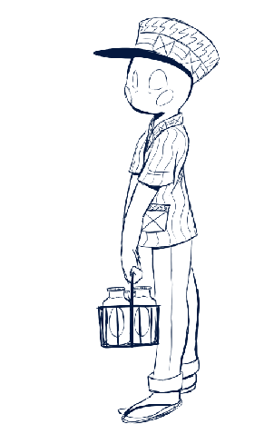
Yeah, so I'd originally tried to switch things around a bit. Like I mentioned in the first Red Wizard WIP post, I'm somewhat critical about my lineart. Wanting to change it, I thought, "Hey, why don't I try to do some chicken scratch lines and make it look all rough and sketchy? That'll look great!" No, not really. The final result of the experiment, as you can see, is sketchy, like I wanted, but not the good kind. It's awkward in places, the lines aren't sure or steady, and up close, it just looks bad. What a waste of 42 minutes...
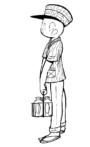
The second lineart is vastly superior. The lines are thick and solid. They seem deliberate as well as offer a more definite outline. Unfortunately, I had to completely scrap the first version and redo the thing, but given the superior final version. it was worth it.


Comments