
Chikumbutso - WIP 2
- Jun 8, 2017
- 1 min read

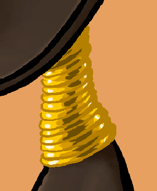

It's good to keep in mind that your pieces can look very different at different vantage points. Up close, while the intention is obvious, her neck rings look kind of grungy, kind of dirty, and overall not really polished. The jaggy lines really stand out.
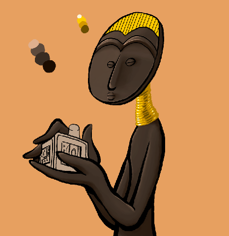
The zoomed out shot, however, looks much better in comparison. The flaws or even just the brushstrokes blur together. Our eyes tell our brain to fill in what we can't perfectly make out, and we fill out the spaces with correct details. I don't claim to be an impressionist, yet that, I feel, is one of the fundamentals of impressionism: the fact that suggesting general shapes and some details allows the audience's imagination to fill in any blanks for whatever effect.
It's not entirely necessary for you to have all your work stand up to close scrutiny. Close to a point, certainly, especially if it's something like a painting that is going to hang in a gallery where people will be looking at it from a very short distance. If it's just meant for scale, however, like a model of a building in the distance for a movie's establishing shot, it does not have to look absolutely authentic up close. Really, it depends on the medium and the context.


Comments